An envelope… Seems simple, doesn’t it? It’s that thing you stuff a letter and maybe an insert or two into, hoping prospects will jump whatever offer you’ve packaged inside. There’s more to it than that.
Let’s look at a recent American Express #10 envelope for a high-yield savings account to see what’s working and what’s missing.
Face Value: First Impressions
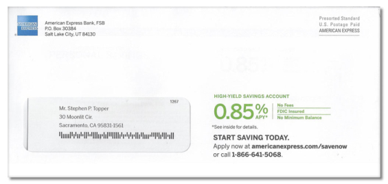
The number one hurdle is to get a prospect to open the envelope and look inside. It’s a momentous challenge, one usually addressed by teaser copy on the mailer’s exterior. But this envelope’s teaser doesn’t tease anything. Instead, it gives up the entire offer right up front:
- The Product (savings account)
- The Offer (rate)
- The Benefits (listed to the right of the 0.85% rate)
- The Response Options (URL, phone #)
A good teaser should give enough information to make the reader curious, but not to much.
Read More: Direct Marketing Clinic: Chase Mailer Pros & Cons, Tips & Tricks
Reality Check: If you’re going to spell out your entire promotion on the exterior of your mailer, you’ve essentially reduced it to a double-sided postcard. You may as well print the words “Do not open this envelope!” on your mailer.
On the opposite end of the spectrum, there are those who say you should leave the outer envelope blank. This is kind of like fishing without a hook or any bait. Nevertheless the theory goes that if a recipient can’t identify the sender or the contents, she must open the envelope to discover what’s inside. The big risk with this approach, however, is that the reader may feel cheated or deceived, and choose to disregard the mailer without further consideration.
And Then There’s The Flip Side…
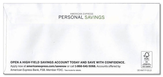
Rarely does the copy on back of an envelope provide any new information, nor does it usually tease readers to dig deeper. The reverse side of the AmEx mailer clarifies the product (it’s a “Personal” savings account) and conveys a promise (“Save with confidence”). By repeating the call to action on the backside, AmEx is making it as easy as possible for people to take the next step — without even opening the mailer.
Let’s Massage That Main Message
The only component inside the AmEx envelope is a letter. Most direct marketing enclosures hold items like a buckslip, brochure, reply envelope or other response device (attached to letter or free-standing). Not this one.
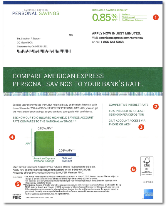
1. Johnson Box. Most often, this “box” showcases the offer. Here, the offer is the special rate and the benefits. The Johnson Box copy is important because it’s one of the most-read parts of the letter.
2. Sidebar. A typical DM letter feature, the sidebar offers a “cheat sheet” or recap of the benefits (as this one does) and often includes response information (phone number, etc.).
3. Is that a typo? The footnote indicator in the sidebar uses the cross/dagger icon. Unfortunately, the tiny icon in the footnote didn’t print well and looks more like a number one. That will confuse readers.
4. Copy and bar chart. A 0.85% savings rate is only impressive when compared to the national 0.08% average. Put another way, it’s over ten times the national average… which would have made a great headline. In a similar vein, the bar chart would look more impressive if it were taller and narrower with the copy moved to the left side.
5. Disclaimer copy. It’s too close to the descriptive copy. It’s better to move the logos and spread disclaimer across the bottom. And seriously, if it’s this close to the offer copy is there really a need for asterisks?
6. The Forest Stewardship Council logo. It’s used to impress upon the reader that the folks at American Express are good stewards of the environment, but the poorly designed FSC logo and lack of brand awareness make its prominence (larger than the AmEx logo) questionable.
The bottom two-thirds of the American Express letter is atypical. No salutation, no closing or signature. Looks like the design was lifted from a print ad.
Read More: Direct Marketing Clinic: Ally Bank’s Email Techniques
A traditional direct marketing letter uses a three-part formula:
- Tell them (opening paragraph)
- Then them what you told them (body of the letter)
- Tell them again (P.S. copy)
The letter from AmEx echoes the offer three times, but using an unconventional combination of elements to achieve the “three-peat” formula:
- Carrier envelope (tell them)
- Johnson Box (tell them what you told them)
- Graphic in the center of letter (tell them again)
Eschewing the traditional direct marketing format, the AmEx letter is missing the important P.S. part. Marketing studies show the P.S. and Johnson Box are typically read first. If hooked by this copy, the individual reads the rest of the letter.
Closing Thoughts
Because this letter doesn’t take the traditional format, it’s more likely a test package — part of a matrix — to determine the best format to use in today’s financial marketplace, rather than a vetted and proven direct response mailer. Either way, this direct marketing package helps prove that traditional mail is alive and well and a channel still being used by the nation’s largest banks, like American Express, Chase Bank, BofA and Capital One.
While this mail package uses a #10 carrier envelope, the same marketing techniques apply to any size envelope package. Use the direct mail three-part formula to compose marketing letters. Include a Johnson Box and P.S. A sidebar is helpful to the prospect. Add other components in the envelope that support and explain the offer and make it seem irresistible to readers and prospects.
Joe Swatek is Senior Copywriter, and Steve Bieber is Creative Director at ACTON Marketing. In their twenty years as a team, they’ve worked with hundreds of financial institutions on direct marketing promotions. They blog at Financial Marketing Insights. ACTON Marketing is a full-service direct marketing organization that provides complete direct mail marketing programs and strategies to financial institutions nationwide. Their work includes complete creative, production, staff training, and consultation.