October 2008 was one of the roughest ever for the financial industry. Now that October has passed (and thankfully so), let’s take a minute to look at some of the ads banks and credit unions ran as the global financial crisis developed.

US Bank – “Roots”
The headline on this full-page ad from US Bank is awkward. The periods in “U.S.” and the overuse of the word “bank” make the headline choppy. Simply using “Bank Solid” would have been enough. Readers understand the implicit call to action: “You should be banking at US Bank.” That’s why advertisers advertise.
The artwork is visually captivating and the metaphor is relevant, although there isn’t a strong connection between the ads’ components (headline, artwork and offer). It feels a little slapped-together, which it probably was. It’s not until you get to the first sentence of the body copy (people read ad copy?) that the “roots” connection is made. The copy also promises a “guaranteed rate of return” on CDs, something BofA has started emphasizing in its ads as well.
Including product offers in your “safe and sound” message is smart. It doesn’t seem practical to run a pure image ad right now — one whose purpose is to simply reassure customers. That kind of ad doesn’t really work to build the brand as much as it “stops the bleeding.”
Unlock the potential of your financial institution's digital future with Arriba Advisors. Chart a course for growth, value and superior customer experiences. Achieve a better return on your marketing investment. Leverage behavioral data and analytics to target the right customers with the best possible offers. Read More about Send the Right Offers to the Right Consumers
Are You Ready for a Digital Transformation?

Send the Right Offers to the Right Consumers
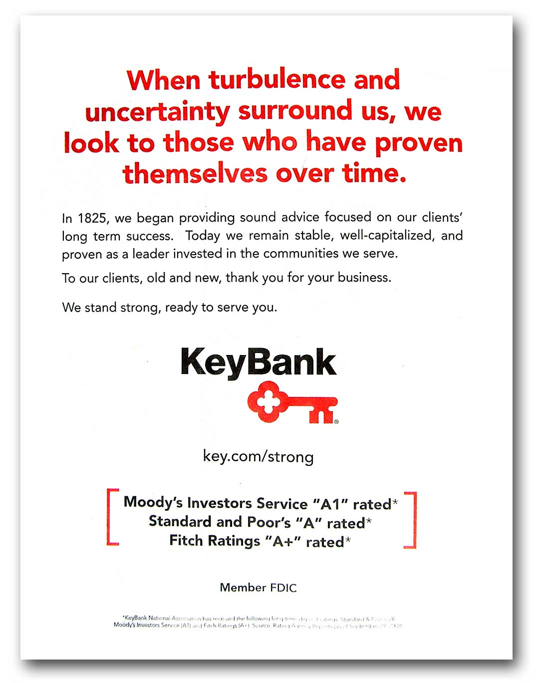
KeyBank – “Proven Over Time”
Any bank could run this ad. All you have to do is change the year in the first sentence of the body copy and swap out logos.
Banks run ads like this all the time. Some banks even run this kind of ad one day, then fail the next. People read this kind of stuff and roll their eyes. Why not provide more proof for the otherwise unsubstantiated claims like “proven over time” and “well-capitalized?” If you’ve got a cap ratio worth bragging about, why not explain it to people? And don’t use the excuse, “They don’t care,” or, “They won’t get it.” The typical American consumer isn’t as dumb or disengaged as you think. She is your wife, or your dad.
Using Moody’s and S&P as “proof” of your safety and soundness won’t fly with those who have been paying attention to financial news lately. These ratings’ agencies are the same bozos who gave triple-A grades to all those toxic subprime mortgage-backed securities.
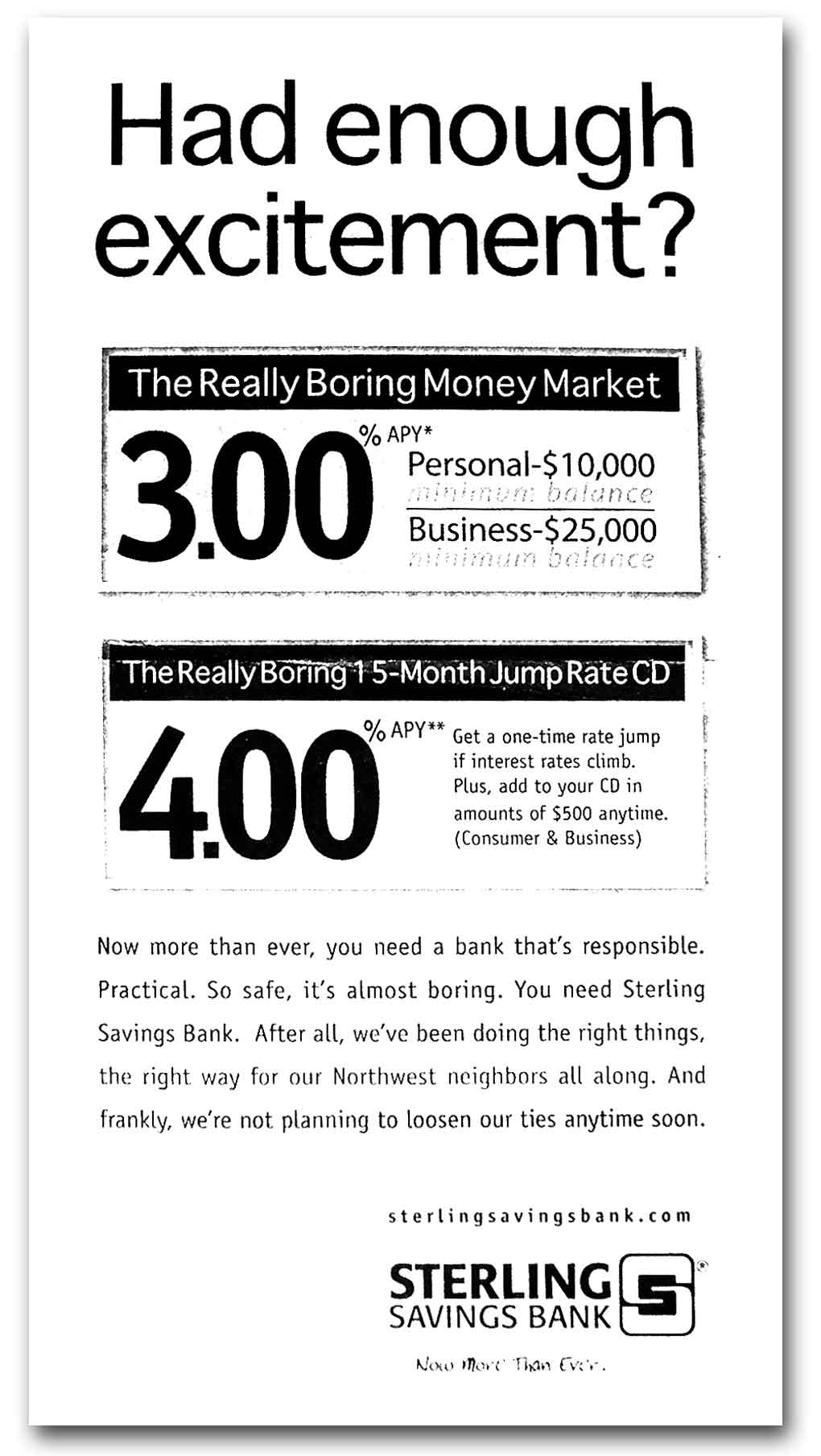
Sterling Savings – “Really Boring”
This ad is great. Sterling is mixing product offers with its “safe and sound” message. The irony is that the bank says it is boring and predictable without being boring or predictable. This ad shows how you can convey a “safe and sound” message without having to surrender any sense of personality your financial institution may have. Temporarily renaming products “The Really Boring [X]” is brilliant.

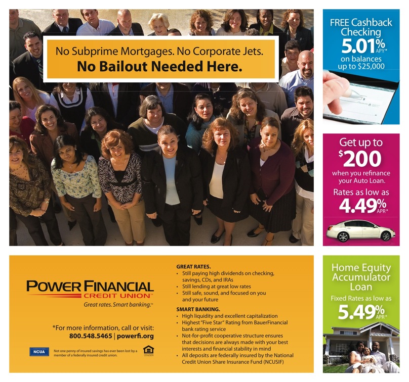
Power Financial – “No Bailout Needed”
This ad for Power Financial from the marketing folks at Shared Idiz shares a similar strategy with Sterling Savings. The ad introduces the “safe and sound” message in a way that connects with people on a visceral level; things like corporate jets really rub the average American consumer the wrong way.
Again, it’s smart to include product offers. This is one of the few ads out there promoting lending (home equity and auto) as part of the “safe and sound” strategy. As previously noted at The Financial Brand, saying you’ve got money to lend in the middle of a credit crisis is one of the most effective ways to differentiate your financial institution while suggesting you’re healthy and strong.
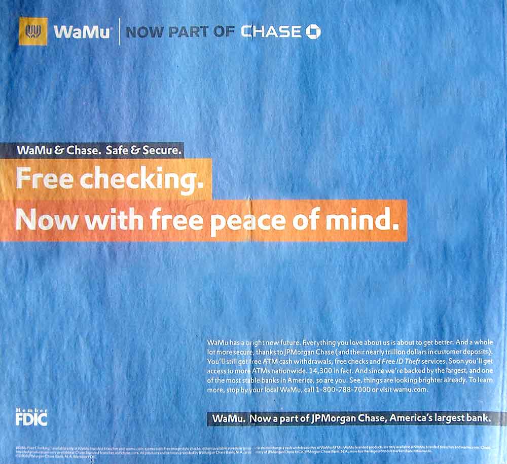
WaMu + Chase = “Peace of Mind”
The headline on this ad from WaMu raises one big, implicit question: Didn’t WaMu checking accounts come with peace of mind before the takeover? It’s the word “now” that triggers the scrutiny. You wouldn’t wonder what was previously wrong with WaMu if the headline simply read, “Free checking. With free peace of mind.”
The body copy in this ad is pretty good. Too bad no one reads ad copy anymore though. If you’re one of the few who does, click on the ad to enlarge it.

Navigating Credit Card Issuing in an Uncertain Economic Environment
Build a modern credit card strategy that balances profitability and risk, adopts the latest technology and delivers the customization that cardholders demand.
Read More about Navigating Credit Card Issuing in an Uncertain Economic Environment

Instant Messaging. Instant Impact.
Connect with your customers and provide lightning-fast support as effortlessly as texting friends. Two-way SMS text messaging is no longer optional.
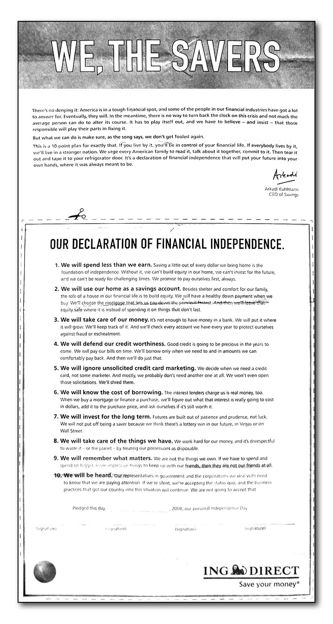
ING Direct – “Manifesto”
As usual, ING Direct is taking its own unique direction on the financial crisis. Recognizing the public’s shift from credit-based spending to thrift-based savings, ING Direct is seizing the opportunity to tell its brand story in one of the most unique ads ever to come from a financial institution.
Netbanker reports that over 5,300 people have gone online to “sign” this “manifesto” at a special wethesavers.com microsite from ING Direct.
Tip of the Hat: To my dad, for mailing all but one of these ads to me.

