Here’s a print ad that jumped out at us… but for mostly the wrong reasons. The ad could use improvements in a number of critical areas.
This ad appeared in a newspaper in December 2012. It’s black and white, an measures about 5 inches wide and 10 inches tall.
1. Vague, Weak Headline in the Wrong Spot
With rare exceptions, the headline should always come first. It’s your main attention-getter. In this ad here, it looks like the bank’s branding theme got in the way. “Freedom” is a meaningless headline. Freedom to what…? Open an account? Visit the location in the photo? Most readers will see the giant word “Freedom” first, then the subhead second, “Contact today for more information.” The ad is asking the audience to take action when folks don’t even know what the ad is about. Is it political? “Something to do with ‘freedom.’ Bah, skip it… Next page.”
A headline should make a big promise or highlight the offer. A stronger headline might have said, “Earn More Interest,” with a subhead that continues, “with a Fab 50 Savings Account.”
If the 0.65% interest rate is high in the market, then it’s a point of differentiation that helps this offer rise above its competitors. If so, make the rate obvious to the prospect.
2. What Is This Ad Selling?
The product, The Fab 50 Account, is stuck at the top of this ad in a box separated from the headline. When it appeared on the newspaper page, this product description seemed connected to the ad printed above it. If readers saw it that way, then from the headline down, what would you think the bank’s ad means?
This box information should be the body of the ad. To further entice the reader, highlight a few benefits, like the phrase “immediate access to funds” that the bank has hidden in the text.
The product name, “The Fab 50 Account,” sounds like it’s intended for prospects age 50+, but that’s not stated anywhere in the copy. Using the revised headline (proposed above), the ad should include a “copy eyebrow” or “kicker” (fancy design terms for “callouts”) above the headline to identify the audience: “For savers 50 and over…”
3. Follow-up Fail
The call-to-action directs readers to the bank’s website. Go there and nothing on the homepage relates to The Fab 50 offer. There should be a dedicated, ad-specific landing page. Absent that, there should be a banner ad on the homepage. The failure continues if you manage to find the page that mentions Fab 50. There’s no account information. You’re told to “Ask one of our Personal Bankers for details.” A big ad with a big headline that goes nowhere. If prospects were interested, you’ve lost them.
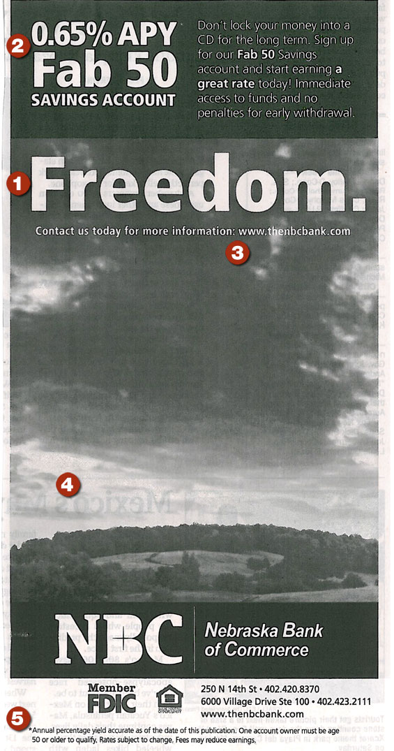
4. Pictures with Purpose
How does this empty scenic image help convince a prospect to open an account? How does a picture of a Nebraska landscape support the Fab 50 product/offer?
Photos should relate to the product you are marketing. Since this account is aimed at 50+ Boomers, then the photo could show age-appropriate members of the target audience enjoying the benefits of saving. People really love looking at photos of other people.
5. Short Disclaimer
Okay, this is a positive point. The disclaimer copy is only three short sentences. Here’s where you discover the account is for the 50+ age group. No one should need to read disclaimers to find important account features. If your intended audience is over 50, then it’s definitely a good idea to keep disclosures shorter and larger than you normally would, as many have trouble reading minuscule type sizes. When you have a short, consumer-friendly disclaimer like this, it’s okay to bump up the type size. Short disclaimers are so rare these days, you shouldn’t try to hide them. There’s no shame in a short disclaimer.
Let’s Improve It
Good print ads — as simple as they may seem — are difficult to write. It takes skill to distill and condense the best aspects of your promotion down into the small space you’re allotted. Headlines must be short, yet strong. Body copy must be brief, but show benefits that convince readers to accept your offer. You need to include a call to action and contact information, as well as all the logos and legal requirements.
To help improve your own print ads, here are some positive take-away points:
Headline that sells. Write a headline that tells people what you’re offering or makes a big promise. Use subheads to further promote your product or offer.
Focus on benefits to consumers, not the product’s features. Outline your product and offer in the body of the ad. You could run bullet points in a “sidebar” to help them stand out.
Be visual, but be relevant. Use photos and graphics that support the message.
Brevity reigns supreme. Ad space is limited. Keep copy brief. Highlight benefits as bullet points.
Be aware of limitations specific to the medium you’ve chosen. Copy reversed out of black in a print ad (where print quality isn’t crisp) is difficult to read. Eliminate or limit reversed type to headline-size copy.
A designer needs to balance these features, choose great photos and graphics, and avoid clutter. All this happens in a relatively small space. The smaller the space, the more economical the arrangement. Use these pros and cons to produce a great promotion for your financial institution.
Joe Swatek is Senior Copywriter, and Steve Bieber is Creative Director at ACTON Marketing. In their twenty years as a team, they’ve worked with hundreds of financial institutions on direct marketing promotions. They blog at Financial Marketing Insights. ACTON Marketing is a full-service direct marketing organization that provides complete direct mail marketing programs and strategies to financial institutions nationwide. Their work includes complete creative, production, staff training, and consultation.