In the year 2000, our entire technology infrastructure was supposed to collapse due to the so called Y2K bug. In 2012, an ancient Mayan prophecy predicted the end of the world. And on April 21, 2015, websites that were not mobile-friendly were supposed to disappear from the internet when Google unleashed its “mobilegeddon” update to their search algorithm.
Like all zesty media events, there has been a fair bit of hype and distortion around Google’s mobile update. What does this really means for your financial institution now that the dust has settled? Let’s take a look, and shed some light on some of the myths around this update.
Why is Google Doing This?
Google’s reason for the algorithm change is simple: to create an optimal online viewing experience for the millions of people using mobile devices to access the internet. Cynical readers might also suggest that Google wants to make more money selling you mobile advertising, and they can’t effectively do if your site looks terrible on a phone.
What Does This Mean for Your Website?
If you do not have a mobile-friendly website, Google says this will only hurt your search rankings when someone is searching on a mobile phone, not a desktop or laptop (and probably not a tablet).
Financial institutions with mobile-friendly responsive websites typically see between 5-15% of their total website traffic coming from searches on mobile phones. So at the most, your website could lose 5-15% of its total traffic, but probably less because Google will probably still return your website on searches for searches like your brand name. In fact, it may not even be relevant for banks and credit unions with old websites, because many outdated sites have “stub” websites of 3-10 pages that are miniature versions of their full website.
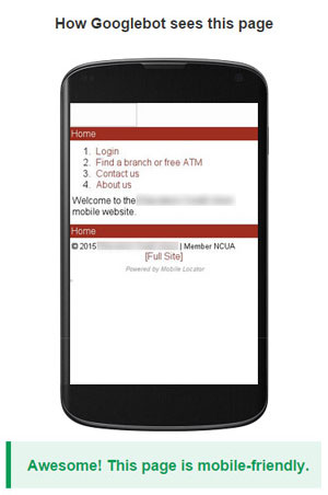
An example of a mobile “stub” website
shown in Google’s mobile-friendly testing tool.
Just keep this in mind: Google just announced last week that searches on mobile devices have now overtaken queries on desktop terminals, and there is no turning back. If consumers can’t find your website when searching on their mobile phones, you’re toast.
Is This The SEO Apocalypse?
No, but it is serious business. This is just the first step that Google is taking to make it essential for business’s online presence to be mobile friendly. Future updates will be coming that are both more punitive (potentially affecting desktop search results in addition to mobile), as well as evaluating other parameters such as the speed of your site on mobile devices. Businesses that don’t prioritize their mobile experience will be increasingly cut off from their audiences through search engines.
More importantly, your mobile experience should be a critical differentiator among consumers. As much as one quarter of the total traffic to a bank or credit union website currently comes from mobile phones, with another 6-8% on tablets. But mobile phone visits have been shown to disproportionately influence consumers’ decisions because they tend to come at an earlier stage in the buying process. Additionally, consumers are having more total interactions with brands than ever before — 11 to find a new financial institution, and 8 to get a credit card — with many of those interactions likely to occur on a phone. That means that one sub-optimal mobile experience could cost you.

A mobile-friendly, responsive website from Trailhead Credit Union (7,400 members and $97 million in assets).
What Makes a Site Mobile-Friendly?
Responsive Web Design. Responsive designs make sites easy to navigate and simple to read on any size screen, without sacrificing the visitor’s ability to access all of your content that they can on a desktop or laptop. The screen size will automatically adjust depending on the monitor size or device the user has.
Key Actions Are Highlighted. Well-designed mobile-friendly sites let visitors do everything they can on a desktop computer, but they prioritize the most common and important tasks for a mobile visitor such as online banking, downloading the mobile app, and finding an ATM or branch. One of the most effective ways to do this is to modify your websites navigation by featuring larger calls-to-action to these key tasks, or putting them at the top of the page.
Mobile-Friendly Formatting. Test your site in a mobile phone to make sure it’s not just your desktop site in a smaller format. Key areas to focus on include: no Flash (doesn’t work on Apple devices), make sure that buttons are large enough to use on a touch screen, the font size is easy to read, make phone numbers clickable, link addresses to the maps app, and make sure forms display in one column.

This mobile menu simplifies navigation.
Tips and Tools to Improve Your Mobile Presence
There are several tools and simple steps you can take to improve your mobile presence.
Google’s Mobile-Friendly Test Tool. Perform a quick test on a single URL to find out how mobile-friendly it is using Google’s Mobile-Friendly Test. Remember though, this only tests one URL at a time, so just because one page passes it does not mean the entire site is safe.
Google’s Mobile Usability Report. If your website is connected to Google Webmaster Tools, this will inform you about possible mobile-related usability problems that Google has discovered while crawling your site. Be sure that you are allowing Google’s mobile bots to crawl your website.
BrowserStack. For power users, this tool that will let you look at your website in emulators of any mobile device you can imagine.