The ING Direct brand was one of the banking industry’s more visible — if not innocent — victims of the financial meltdown triggered by the mortgage bubble that collapsed back in 2007. ING Direct’s parent, ING Groep, was forced to divest from both the U.S. and Canadian markets as part of a bailout arrangement with the Dutch government.
But unlike other victims of the financial crisis including notable brands like WaMu, Countrywide and Merrill Lynch, ING Direct’s U.S. and Canadian operations were healthy and viable — much more so than their parent company, ING Groep. Both units easily found suitors, with ING Direct in the U.S. going to Capital One (since renamed 360), while the Canadian counterpart was scooped up by Scotiabank.
As a part of the agreement of their acquisition by Scotia, ING Direct Canada knew they would have to formally change their name. The objective of their renaming project — initiated back in 2012 soon after the deal closed — was to reinforce all the positive attributes that customers had long associated with one of banking’s most beloved challenger brands. Peter Aceto, President and CEO, said they also wanted to transform perceptions of ING Direct as a small bank offering little more than high-interest savings accounts to that of an institution offering a full suite of simple, everyday banking options for Canadians.
There were two things that Aceto wanted to achieve with the new name. One was to protect as much of the brand’s equity as possible, while also differentiating the bank from its competitors.
In November 2013, ING Direct finally announced their new name: Tangerine.

“When we launched, having a bank called ING Direct then was odd, because everything was named “Bank.” A lot’s changed since then,” Aceto says.
“Tangerine and the new visual identity exemplify everything ING Direct has represented since its start in Canada in 1997, specifically its continued focus on being an innovative and progressive alternative for Canadians who embrace forward banking and banking in a direct way,” Aceto explains. “It reflects everything our clients love about us and what everyday banking can be: simple, flexible, accessible, progressive and innovative.”
“What Canadians are seeing is the culmination of nearly two years of strategic planning, research, development and execution,” said Andrew Zimakas, Chief Marketing Officer at Tangerine.
The bank says it spent nearly 12 months on due diligence alone, consulting with more than 10,000 Canadians, employees and clients through qualitative and quantitative research.
Will Customers Eat Tangerine Up?
“We changed our name because we had to,” Aceto says. “It wouldn’t have been my preference. It takes a lot of time and energy and it’s expensive. And it’s disruptive for your customers.”
That’s why Aceto went with Tangerine. Not only would it allow the bank to preserve its signature orange color, the word “Tangerine” also works in both English and French. “Orange” was excluded as an option — it was already taken as a trademarked brand name, and Aceto felt it was a little too obvious and safe.
For all the things that are right with the Tangerine name, one big question loomed large in everyone’s mind: Would ING Direct’s customers — including thousands of rabid fans — swallow the rationale behind the tangy fruit? Or would there be a revolt?
Aceto remains unshaken, with utter confidence in the strength of the underlying brand he’s helped build since taking the helm from Arkadi Kuhlman back in 2008.
“We understood the risk that a name like that could be interpreted as being silly, or not serious,” Aceto acknowledges. “I want people to think, ‘Oh, they’re different. They’re not like everyone else.’”
Most experts in the branding field seem supportive of the new name. Armin Vit, publisher of a popular branding blog, is among them. “Given that ING Direct could not hold on to their name, they had to go big… or go generic like most banks do, based on the assumption that banks should look serious and boring,” Vit wrote in his review of the new brand. “Boy, have they gone big. Choosing Tangerine as a name is a bold, ballsy move. The more you let the name sink in, it’s a rather impressively sticky name. It’s memorable. It stand outs in the banking sector. It’s interesting.”
Today, Tangerine serves 1.9 million clients and has close to $38 billion in total assets, making it Canada’s leading direct bank. They have over 1,000 employees in Canada, and five café locations.
Only One Chance to Make a First Impression
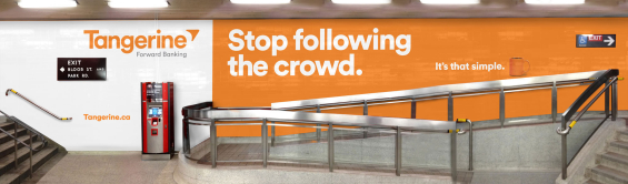
The new brand was rolled in two phases. The first phase was a transition period that communicated the name change while reinforcing that the bank’s core values would remain intact. The second phase was built around an ad campaign focused on the simplicity of banking with Tangerine. Ads began to debut in April 2014.
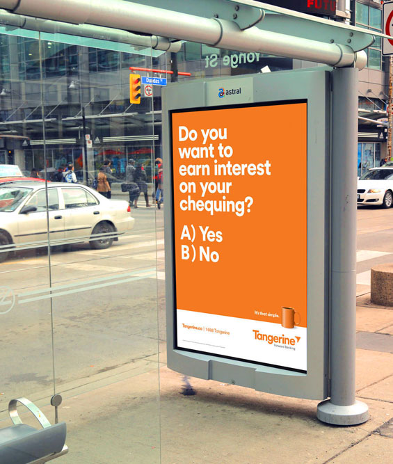
Tangerine’s media plan for the name change included a wider use of television, nearly 70% higher than previous company airings. Other media channels include radio, transit/out-of-home, print and digital advertising. Tangerine is also investing heavily in contextual pre-roll advertising on YouTube, and contextual search engine marketing that will engage consumers in a relevant way when they search for common, non-financial related topics (something Tangerine says is a first for a Canadian bank).
National presence through various media will spread beyond Canada’s larger urban markets of Toronto, Montreal, Calgary and Vancouver to include Halifax, Moncton, Edmonton, Regina, Saskatoon, Winnipeg, St. John’s and Charlottetown, as well as smaller communities in Ontario and Quebec.
“You only get one chance to make a first impression,” ZImikas cautioned. “We wanted this campaign to not only be memorable, but to reinforce the values inherent in the brand.”
For its television ad production, Tangerine enlisted award-winning director Martin Granger and feature-film cinematographer Barry Peterson who is known for his work on blockbuster comedies such as Zoolander, 21 Jump Street, We’re the Millers and The Lego Movie.
The new name was developed by Lexicon in California, the same company that developed monikers like Blackberry, OnStar and Febreze. The new logo came from Canada-based Concrete, and advertising will continue to be handled by john st., an agency located in Toronto.
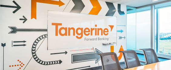
Visual Vocabulary
The simplistic iconography Tangerine uses throughout its brand identity clearly reflects the bank’s philosophy.
![]()
Interior Branding
As part of its efforts to bring its new brand identity to life in its corporate offices, Tangerine tasked Concrete to create environmental design elements to convey the bank’s corporate values and brand attributes to employees and visitors.