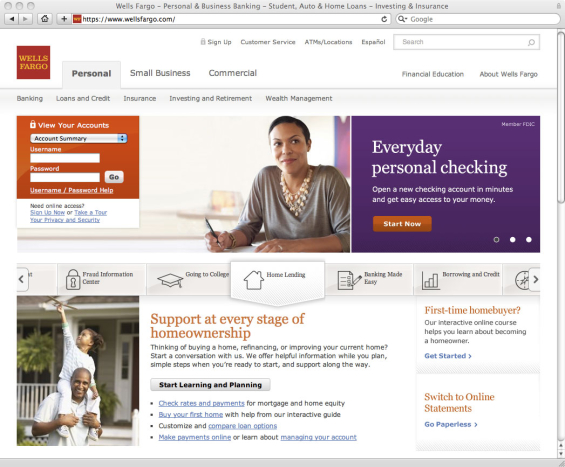
The bank’s new design replaces a messy “link farm” with a snazzy interactive ribbon structured around life needs, but reviews of the site are mixed.
For the redesign of its website, Wells Fargo outlined three parameters. It needed to give users quicker access to information. It needed to offer a more personalized experience. And it would need to be tablet-friendly.
In early June, Wells Fargo rolled out the result of their toils: a new homepage for the bank’s 22.5 million active online customers.
“We are taking away potential clutter and providing a lot more white space and simplicity,” explains Shannon Lundgren, VP with Wells Fargo’s internet group.
Wells Fargo is keen to stress the importance of using its website to capitalize on the rich capabilities and experiences that tablet devices offer.
“In 2006, a ‘tablet’ was medicine,” the bank joked on Twitter. “In 2013, it’s the way millions visit our website. Our new design accommodates that.”
But the extent of the website’s changes are severely limited. Only the homepage and “About Us” sections were redone. Most everything else — including all product pages and the online banking system — remain unchanged.
( See More: 50 Of The Most Spectacular Website Designs in Banking )

The new Wells Fargo homepage design uses an interactive ribbon — the “carousel” — to organize information on banking products.

Navigating Credit Card Issuing in an Uncertain Economic Environment
Build a modern credit card strategy that balances profitability and risk, adopts the latest technology and delivers the customization that cardholders demand.
Read More about Navigating Credit Card Issuing in an Uncertain Economic Environment

How Banks Are Fortifying Their Data Against Increasing Cyber Threats
This webinar from Veeam will detail the value of working together across your organization to be better prepared in cyber defense and response readiness.
Read More about How Banks Are Fortifying Their Data Against Increasing Cyber Threats
Lifestage Carousel
According to Bank Technology News, what sparked the redesign was an aging admin interface. The content management system (CMS) Wells Fargo previously used to manage its website was slated for retirement. When the CMS vendor announced the technology’s end of life, Wells Fargo figured they may as well update the homepage while they were at it.
Even though obsolete technology may be the real nexus behind the makeover, Wells Fargo isn’t afraid to put a positive spin on it.
“We’ve really focused on making it easier for customers find financial solutions by grouping them around particular needs or life events,” says Brett Pitts, EVP and Head of Digital Product Management at Wells Fargo.
What Pitts is talking about is the new interactive ribbon of financial products organized by lifestage or financial need. Wells Fargo calls it a “carousel.”
“I compare it to sitting down with a personal banker to uncover information and tools that help you better understand your financial needs and discover relevant options,” Pitts explains.
“The goal is to bring the consultative service approach from our 6,200 stores to the online environment,” Wells Fargo spokesman Josh Dunn said in an interview. “We want to make it easier for visitors and customers to learn about financial topics, make good financial choices and ultimately get the financial products and services they need to succeed financially.”
( More: Scavenger Hunt Entices Customers to Explore Bank’s Remodeled Website )
The Expert’s Critique
There is probably no greater authority on the state of Wells Fargo’s website than Jim Bruene, publisher of Netbanker and the Online Banking Report. Bruene has been taking screen shots of the bank’s website since at least 2004.
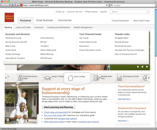
He says the biggest change is the elimination of the “link farm” navigation the bank has used as its primary navigation system for the last nine years. They replaced roughly 30 static text links on the homepage with fly-out “mega menus” that expand over the top half of the page when you scroll over them. It’s still a lot of links to put in front of users, but it’s better than before.
“The homepage is still slightly cluttered for my tastes,” notes Bruene. But Bruene says many Wells Fargo customers have grown accustomed to the bank’s no-nonsense approach to web content and navigation.
Ultimately Bruene’s sense of realism and practicality trump whatever criticisms he may have.
“I think the bank has done a good job managing the tradeoff between simplicity and exposing all that it has to offer,” Bruene writes in a blog post. “The new site maintains the overall look and feel of previous generations while overhauling top-level navigation. While it may not win design awards, the new layout works.”
Bruene says Wells Fargo’s content ribbon (the “carousel”) is a design innovation other financial institutions will use in the future.
( Read More: Bank’s Redesigned Website Includes Crowdsourced Support Forum )
No Love for Social Media on New Homepage
Wells Fargo has long been regarded as one of the first and most progressive pioneers in the social media space. They’ve been on YouTube since March 2006 and on Twitter since March 2007. Nevertheless, Wells Fargo chose not to put links to any of its social channels on the homepage in its new design. You have to dig down to the “About Us” section or the online newsroom to find links to the bank’s Facebook, Twitter and YouTube accounts — far from conspicuous.

Reaction on Facebook
When Wells Fargo published an update on Facebook about the new website design, 800+ of the bank’s 525,000 fans promptly took a look. A second status update a few days later triggered another 350+ visits to the site. Between the two Facebook posts, Wells Fargo received about 50 comments with feedback and suggestions.
Most of the comments ranged from tempered praise (“it’s cleaner”) to apathy (“I didn’t see a difference”). Many users were at first surprised, but ultimately conceded they liked the new site and just needed a little time to get used to it.
A few users noted that if you’re not careful when scrolling over the new drop-down interface at the top of the page, the mega menus will cover the User Name and Password fields in the online banking login field — a minor annoyance.
No Makeover for Online Banking
A few customers said they cared less about the homepage, and instead were more interested in when — or if — the online banking section of the website would be revamped.
“It’s the page I spend the least amount of time on,” wrote Brian Dear on Facebook. “I log in to online banking and that’s where I spend my time. Making online banking more friendly needs to happen and happen soon. It’s very clunky to use. There’s no real flow to it.”
( Read More: Wells Fargo Mini-Branches And The Shrinking Retail Footprint )
Is This a Phishing Website?
A number of customers had security concerns when visiting the new website for the first time. Joel Blodgett said he was worried he somehow got misdirected to a phishing site when he first saw the design. Others echoed Joel’s fears.
Online bankers are the only ones who would worry about phishing scams, so it’s a little strange that these customers could be caught off guard. You’d think that every online banking customer with an active, valid email address would have been notified by Wells Fargo — multiple times — about a major website remodel.


