Here are 50 of the most visually stunning websites from banks, credit unions and other financial institutions around the globe. These look nothing like the bank websites of yesteryear.
The new design aesthetic emerging in banking is one mirroring other consumer retail sectors. Thanks to faster internet speeds, it’s now possible to use huge pictures and sprawling backgrounds to create a visual drama unimaginable just a few moons ago.
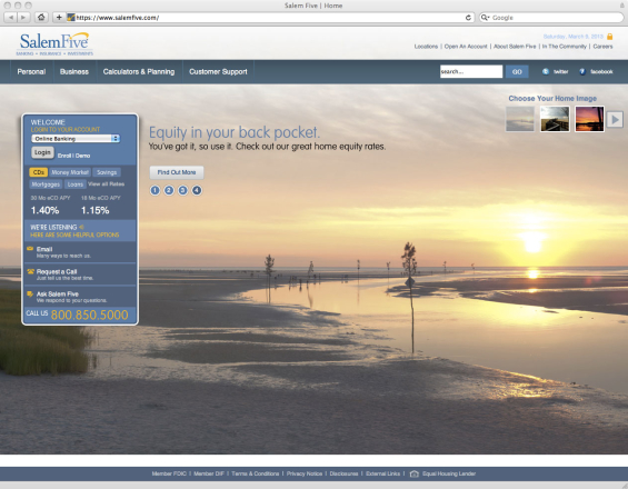
#1 – SalemFive Bank
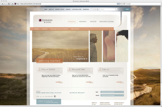
#2 – Johnson Bank
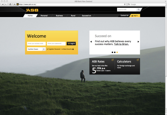
#3 – ASB Bank
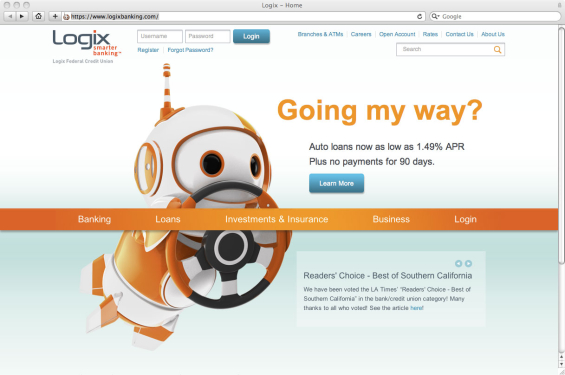
#4 – Logix Federal Credit Union
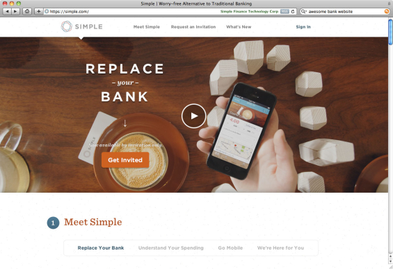
#5 – Bank Simple
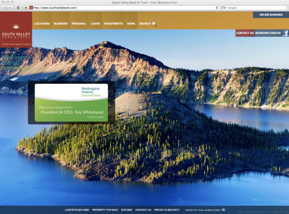
#6 – South Valley Bank
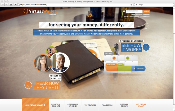
#7 – PNC Virtual Wallet
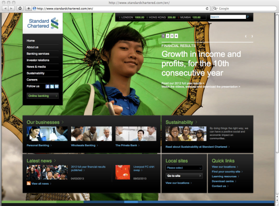
#8 – Standard Chartered Bank
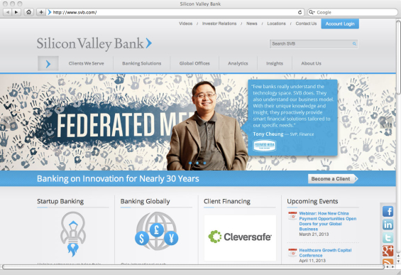
#9 – Silicon Valley Bank
#10 – USAA

See More: 30 More Gorgeous Banking Websites
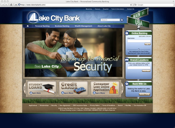
#11 – Lake City Bank
#12 – Mango Money

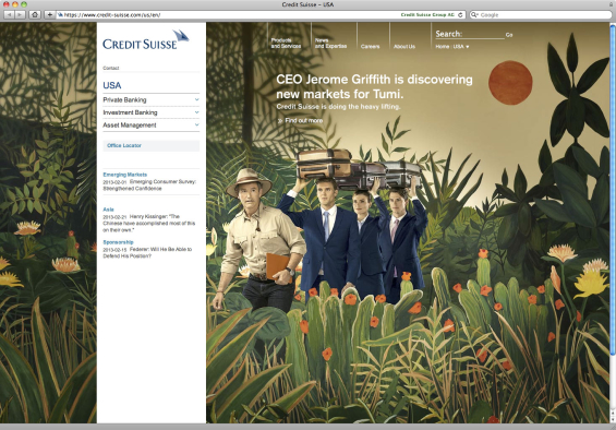
#13 – Credit Suisse
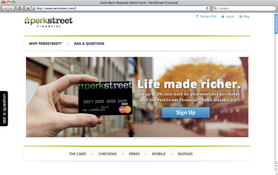
#14 – PerkStreet Financial
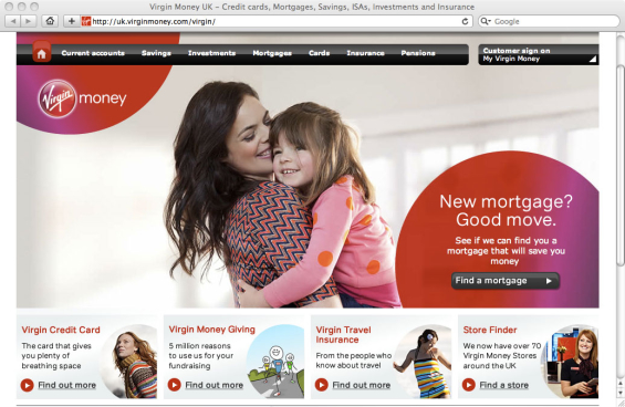
#15 – Virgin Money
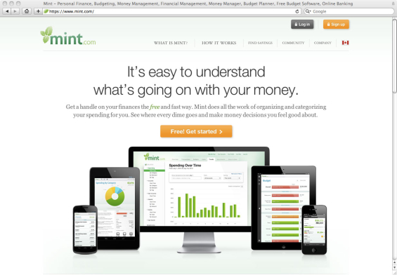
#16 – Mint
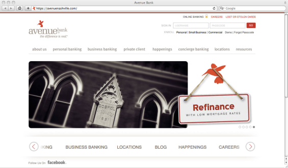
#17 – Avenue Bank
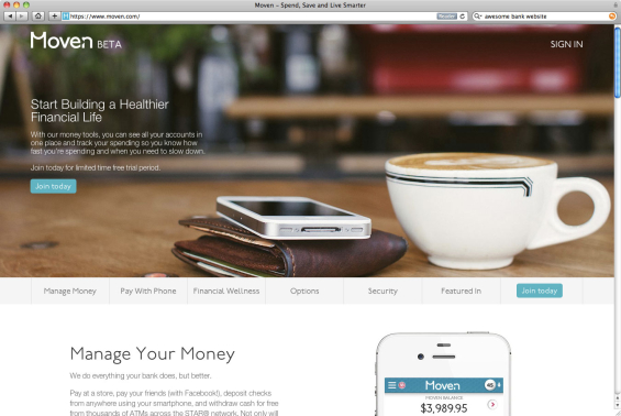
#18 – Movenbank
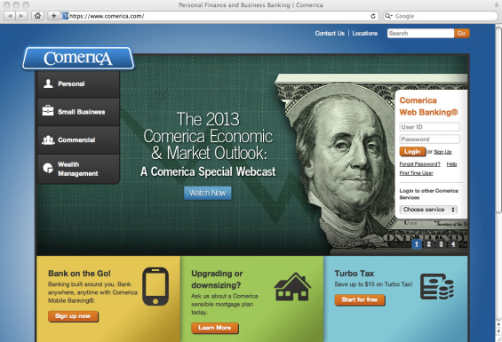
#19 – Comerica
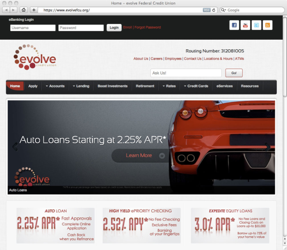
#20 – evolve Credit Union