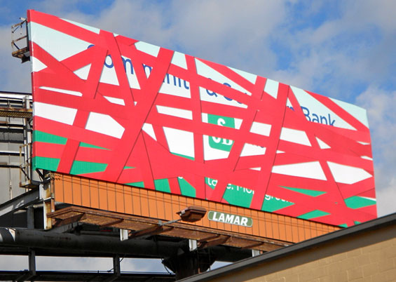
No Red Tape
Community & Southern Bank ran this teaser billboard near its branches in the Atlanta area. The “red tape” was removed in a subsequent billboard to reveal the advertiser. Whenever running outdoor ads, you have to think creatively.
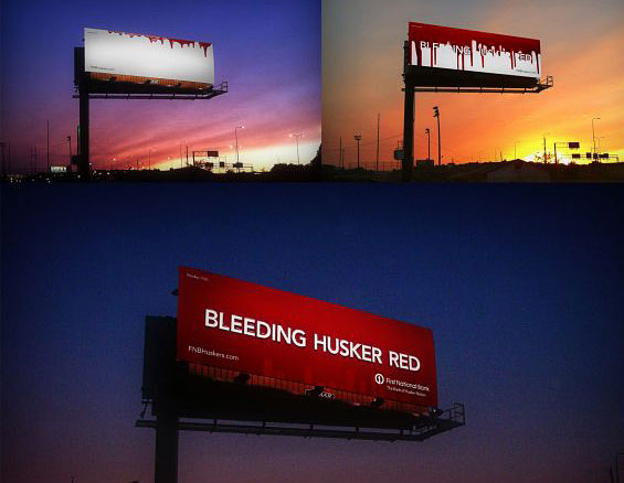
Bleeding Husker Red
For financial marketers looking to position their brand as “local,” one approach is through affiliations with sport teams. In this clever series of billboards, First National Bank shamelessly panders to Nebraska Cornhusker fans, claiming they “Bleed Husker Red.”
Qrossword Puzzle
Citibank created this large, complex, fully-functional crossword puzzle that doubles as a QR code, inserting the unusual ad in a major magazine in the Indian market. If readers needed help with the puzzle, they could scan the QR code with their smartphone to get the solutions. The solution page transitions into an ad about Citi’s mobile banking services. A crossword as a creative device is great, but don’t use one if it isn’t actually a real puzzle (like this credit union failed to to).
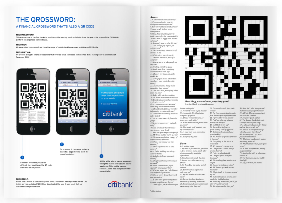
The ad agency’s case study is shown left, with the actual ad that ran in magazines shown right.
Breaking a World Record
Commonwealth Bank assembled 935 people wearing Aussie team colors to break the Guinness World Record for “most people wearing the same team uniform in a photo.” This stunt, organized by Commonwealth as part of the 2012 Olympics, reminds financial marketers that there is a lot more to PR than just pounding out corporate press releases. By organizing this event, Commonwealth managed to get themselves on the front page of every paper, on the homepage of every new website, and on every news broadcast in Australia. And what did it cost them? Basically nothing. All they had to do was invite a bunch of Aussies to a barbie, then give them beer and jerseys. “Say cheese! Thanks!” There are a lot of records in the Guinness book. Why not try to break one at your financial institution?

935 Aussies — all wearing the same jerseys — pose for a record-breaking photo.
Pretty. Ineffective.
These ads are beautifully executed, and will probably win some awards. Unfortunately, they are also a waste of money. According to conventional advertising wisdom, 80% of the audience only reads an ad’s headline. If that’s true, then Co-Op Financial Services has flushed fourth-fifths of its investment down the toilet (never mind that magazines are a dying medium). Creative ad agency types love to argue that “it’s important to intrigue the audience with an engaging narrative.” But no one has the time to decipher cryptic headlines and figure out what the heck the advertiser was trying to say — “Tell me what I need to know, why I should care and what you want me to do about.” Advertising — at its core — is about conveying relevant user benefits. But even the subheads in these two ads are soft. The only clue into what these ads are about — credit unions — is buried near the end of the body copy. While the credit union industry desperately needs some sort of broad awareness campaign, this isn’t it.
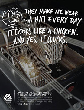

What are these ads about? What is the reader being asked to do?
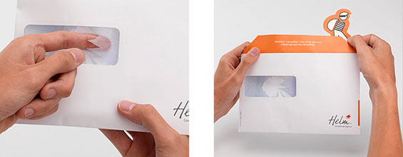
Direct Mail Robber
This Helm Bank mailer promoting property insurance uses the same style envelope as those the bank uses to send account statements to customers… only someone has “broken in” to the address window pane. There is no accompanying letter — it has presumably been “stolen.” Only a little cutout robber remains inside, with a brief message and URL to a page on the bank’s insurance products. While this is an insurance promotion, financial marketers should not ignore the design lesson here: You should always do something unique, unusual and creative with your direct mail. If you’re just sending out boring postcards and straight letters in #10 envelopes, you’re leaving money on the table. Anything you can do to increase reader engagement and the time they spend interacting with a piece, you will see response rates climb.
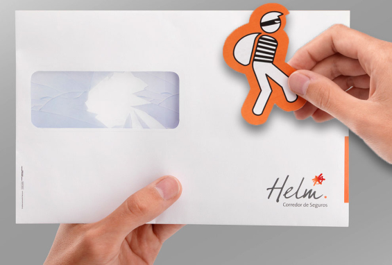
“Ack! Someone stole my bank statement! There’s nothing inside but this little orange… Oh wait, this is pretty clever!”
You Want Me to Change the Sign? Okay…
It’s hard to tell whether there’s a snarky 20-something working at Central Star Credit Union, or if this is a deliberate attempt at humor sanctioned by the C-suite. Either way, it’s pretty dang funny.
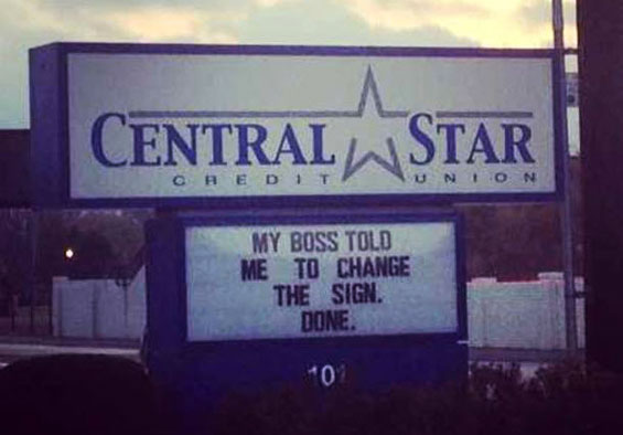
VP to marketing intern: “I’ve asked you a hundred times to change the sign.” Intern to VP: “Umm okay, what should it say?” VP to intern: “Whatever. Just figure something out.” Okay…
Male Cleavage
On the one hand, you could argue that a topless dude isn’t really offensive. But on the other hand, you could argue that Americans — with all their hypocritical Puritanisms — would find nipples inappropriate in any form of marketing. This isn’t the first time a financial marketer has affixed their gaze on human cleavage. US Senate FCU found itself in hot water after promoting loans for boob jobs in a mailer that left little to the imagination. And DBS Bank in Singapore has a titillating debit card design titled “Deep in the Valley.”
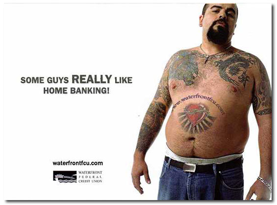
Notice the credit union’s website URL “tattooed” on the guy’s belly.
Little Toy Car
Town & Country Credit Union parked this antique toy car in its parking lot to promote a United Way charity auction (attendees could bid on the car, among other things). While this stunt is only being used for charity in this example here, it’s not hard to see how something like it could easily be adapted for an auto loan promo: “Tired of driving around your old jalopy? Ask about a new car loan inside.”
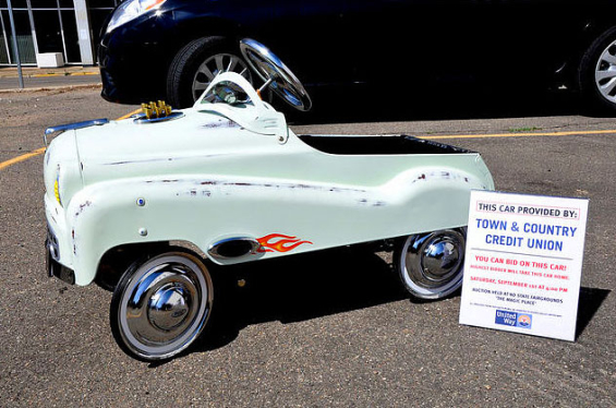
Tip: Chain the thing to a bolt stuck in the concrete if you don’t want to see it magically disappear.
Piece of Cake
A delicious way for the staff at a Regions Bank branch to say “thanks” to a customer. It doesn’t look like something Regions has institutionalized on a broad level across the bank, but there’s no reason they couldn’t.
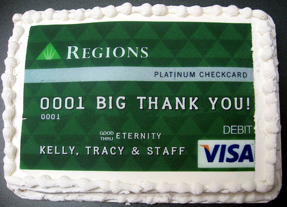
Now this is the kind of marketing you can really sink your teeth into 🙂
Excessive Disclosure*
If your offer is so complicated that it takes eight square inches — over a third of your ad space — to deliver the terms and conditions, one of these things needs to happen: 1) you need to find a new lawyer to write your legalese, 2) your compliance person needs to switch to decaf, and/or 3) you should just scrub the promotion entirely. *See this article here for details.
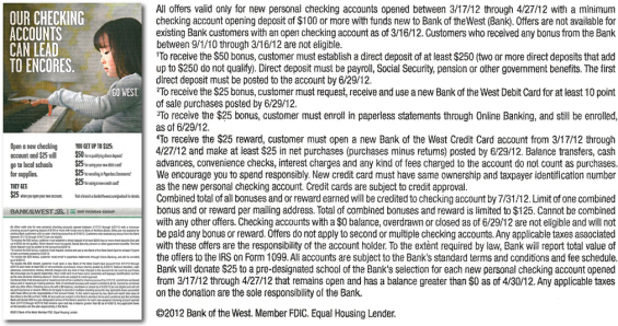
Yes, the cash back scheme is complex. But with just some simple editing, this disclosure could be shortened by at least 50-100 words. Even then, it’s still too long. (Tip of the Hat: To ACTON Marketing for first pointing this ad out.)
Bad Billboards
Granted, outdoor advertising is a tricky medium. But that’s no excuse for these two bank billboards. Worthington is playing off a cultural insecurity shared by many women, “Does this ____ make my butt look big.” Maybe in Texas, where Worthington is based, the size of one’s ____ makes a difference. Even then, it’s wasted space. It’s narcissistic, and conveys nothing about the organization, nor financial services, nor the benefits of choosing Worthington.

This billboard for Manasquan Bank is just plain weird — almost surreal. “This summer, bring the bank with you…” To the pool while you’re on vacation?? A young male banker wearing a suit serving margaritas to a young female customer clad in a bathing suit while she lounges in the pool? The banker, with his corny thumbs-up, comes off somewhere between “dork” and “creepy stalker.” Bizarre. [Note: The agency responsible for creating this billboard asked a photo of it be removed from this website, ostensibly for copyright reasons.]
Sculptural Data Visualizations
What looks to be a contemporary art exhibit is actually a large scale data visualization.The concept behind the “exhibit” was to create an annual report for L-Bank which allowed viewers to take “a walk through a museum.” Figures for eight of the bank’s business segments are displayed using objects like balloons, doors and even jumbo Legos. For financial marketers who are perpetually forced to work with dry financial data, it serves as a reminder that there are indeed new and creative ways to present information. There’s more to numbers than charts, graphs and Microsoft Excel. Source: Visual News.
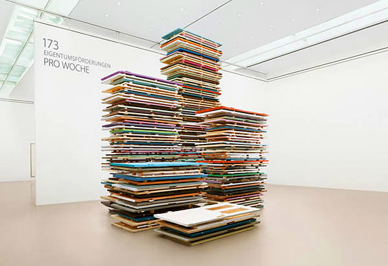
173 new home loans per week, visualized with stacks of front doors.
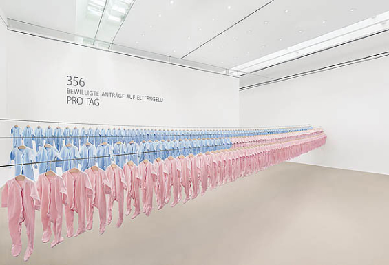
L-Bank illustrates how they help 356 families every day.
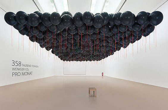
358,000 tons less CO2 per month, thanks to L-Bank’s approach to “clean” lending.