The time has come to bid adieu to ING Direct,one of the financial industry’s most admired brands. The scrappy online startup had built a passionate and devout following among consumers and banking industry insiders alike. Between the online bank’s cool online tools, higher deposit rates, stellar customer service and quirky, optimistic personality, there was a lot to love. Now everyone is wondering if Capital One will kill the direct bank’s reputation for killer service and innovative ideas along with the ING Direct name.
When Capital One bought ING Direct USA back in February for $9 billion, the agreement did not include the sale of the online bank’s venerated name. Capital One had one year to completely phase out “ING Direct” and other elements like ING’s signature orange color and logo ball. This left the acquirer, Capital One, in an unenviable position: they would be forced to kill one of banking’s favorite brands.
The new name they chose?  Capital One 360.
ING Direct Head of Banking Jim Kelly and Capital One President Jon Witter began notifying customers of the new logo and name in a joint message to customers a few weeks ago. “Our name is changing to Capital One 360 and our colors are changing to red and blue, but our commitment to you is staying the same,” they promised. “We’ll have a new name and fresh look on the outside, but it’s the same ING Direct you’ve come to know and love.”
To their credit, both Kelly and Witter included their personal email addresses in the email sent to customers.
So what’s the story behind the 360 name? Why did they pick it? ING Direct spokeswoman Laura DiLello says they chose “Capital One 360” because “we are surrounding our customers with high-value digital banking services that they can access when and where they want.” In other words, a full suite of banking products rounded out by 360° convenience.
When asked about the new name’s meaning, another ING Direct spokesperson on Twitter said “360 means bringing saving full circle,” although what that means exactly isn’t immediately clear.
Capital One said it took “a long time coming up with a new name and logo and we gave it a lot of thought.”
“We were looking for a name and logo that are forward-thinking while also giving a nod to our past,” they explained. “We think that Capital One 360 does just that. The name and logo symbolize that we’ve come full-circle, starting this journey with a new family, but still believing in the same things.”
Capital One joins other financial institutions who have embraced the “360” theme in their brand names, most notably 360 Federal Credit Union and Coast360 FCU.
Navigating Credit Card Issuing in an Uncertain Economic Environment
Build a modern credit card strategy that balances profitability and risk, adopts the latest technology and delivers the customization that cardholders demand.
Read More about Navigating Credit Card Issuing in an Uncertain Economic Environment

How Banks Are Fortifying Their Data Against Increasing Cyber Threats
This webinar from Veeam will detail the value of working together across your organization to be better prepared in cyber defense and response readiness.
Read More about How Banks Are Fortifying Their Data Against Increasing Cyber Threats
The official change to the new Capital One 360 brand identity will take place February 1, 2013. So why would Capital One announce the new name now instead of waiting until February when customers can see the entire new brand in context?
Some brand experts might criticize this kind of phased approach — leaking the name out now and the rest of the brand later.
“We wanted to make sure our customers were the first to know and give them a chance to get used to the name before the change goes into effect,” DiLello added.
And what are they going to do about those Orange Cafés where ING Direct customers could sip and save? Capital One says the cafés will definitely be kept open, but they will be getting a fresh coat of paint in February when the full rebrand takes hold. They won’t comment on the new color scheme, but you can be certain that anything orange is out of the question. As for the name, the safe money is on “360 Café” taking the place of “Orange Café.”
Capital One Tries Putting On Happy Face
Capital One is trying desperately to convince customers that the rebrand is superficial and only cosmetic in nature — that the underpinnings of the ING Direct experience will remain untouched. So they rolled out a customer pledge, building on ING Direct’s brand promises:
- We’ll deliver real value. We’ll continue to be home to no-fee, no-minimum checking and savings accounts — with the great rates that we know are important to you.
- We’ll keep it simple. There will always be simple, intuitive digital and mobile access to your accounts.
- We’ll keep a human touch. We’ll talk to you as we always have, with real people here ready to help you.
- We’ll focus on you. We’ll always innovate and improve with you in mind, first and foremost, to create the best customer experience out there. We’ll keep challenging the way things are done, and get them right the first time.
You really have to sympathize with Capital One. They are in a no-win situation with the ING Direct rebrand. Besides perhaps only USAA, there is no bigger financial brand in North America than ING Direct that consumers are more passionate about (at least in a favorable sense). ING Direct has some 7.7 million customers, with a fair number of rabid fans among them. Assuaging fears without looking like a heartless brand assassin isn’t an easy job. The best Capital One can hope for is to minimize backlash and quell any potential revolt.
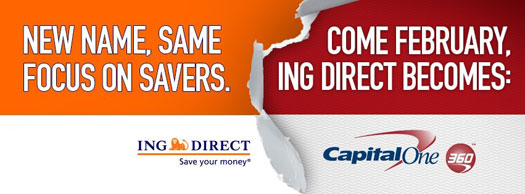
Seen on ING Direct’s Facebook page, this banner ad tries to stress how little will be changing with the Capital One takeover.
Corporate communications from both ING Direct and Capital One reflect a subtle tone of reluctance to change names. Everyone knows this is isn’t the ideal situation. Both parties are quick to point out that axing the ING Direct brand wasn’t their idea.
“As we told you back in June 2011, our parent company (ING Groep) agreed to sell ING Direct USA as part of a restructuring agreement with the European Commission,” the online bank explained on its website. “ING Groep allowed us to use ‘ING Direct’ only until February, 2013. So we had to come up with something new.”
Translation: “We’re being forced into this unfortunate name change because our parent company got carved up as part of a government bailout.”
“We’ll do our very best to make this transition as smooth as possible,” ING Direct said to customers reassuringly. “We’ll give you all the info you need, every step of the way.”
Translation: “None of us look forward to this, but hey… we gotta do it, so we’re going to try to make the best of it.”
Normally upbeat, the communications team at ING direct has eschewed tail-wagging and smiles for snark and sarcasm. “If you think about it, the name ING Direct is just a name,” the bank says in its defense. “Who we are on the inside is the same, whether our name’s Capital One 360, ING Direct or Aunt Bertha’s Bank.”
It’s subtle, but you can feel their frustration.
What about the new colors?
“Red’s the new orange,” said Capital One, in reference to ING Direct’s monochromatic citrus color scheme. “Since Capital One’s colors are red and blue, our new colors are going to be red and blue, too. After all, we’ve got to make sure we’re color coordinated and looking good for the family photo.”
It’s tempting to roll your eyes at marketing puffery like this until you realize just how hard it is to communicate a rebrand to customers, particularly one where there isn’t a strong rational argument. What else can they say? “Lawyers say we can’t use orange, so we’re going with what we’ve got… which is red and blue, so deal with it.”
You can’t fault anyone at Capital One or ING Direct for wanting to put a happy face on this situation. Nevertheless, some of the corporate messages feel a bit tinny. “We love orange too, but we think red will look good on you (and us),” ING Direct tweeted.
Really? Most customers who wore orange ING Direct shirts with pride probably won’t be wearing Capital One 360 shirts at all. People wear clothes to make statements about themselves. And the statement made by a day-glow orange shirt for a scrappy online upstart is a lot different than the statement made by a shirt pimping an established megabank with traditional red/blue colors. Come on guys… the ING Direct rebrand is a little more than a color shift, and such a suggestions dismisses the significance of brands and how consumers relate to them.
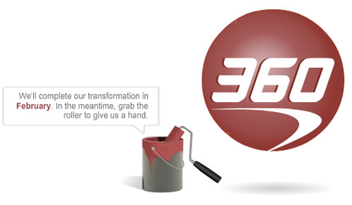
At the new website for Capital One 360, the bank invites users to roll a new coat of red paint on top of the signature ING Direct orange ball. While the execution is somewhat fun (you get to play with a little interactive paint roller), the overall concept will likely leave a sour taste in many ING Direct fans (like taking a Sharpie pen to the Mona Lisa).

Change Stirs Up Critics, Tough Questions
There probably isn’t any new name Capital One could have picked that wouldn’t have been criticized at least to some degree. But some opponents of the 360 name are downright vitriolic.
“ING Direct is now Capital One 360. Somewhere a brand manager needs to be fired,” complained Whitney Hess, a UX expert, on Twitter.
Jim Perry, a bank branding consultant, thinks 360 is a bad move too. “Capital One is making a big mistake with this rebranding,” he tweeted.
Jim Bruene, publisher of Netbanker is a bit more diplomatic with his analysis. “While I like the ‘360’ thing,” he wrote in a blog post, “I’m a little disappointed they didn’t give it a separate brand, like NAB’s UBank,”
Pointing out the strong connection consumers feel with the ING Direct brand, Bruene noted: “Long-time fans are wondering how much of the old ING Direct quirkiness will be maintained, if any.”
A potential conflict between brands started brewing from the moment Capital One announced its acquisition of ING Direct.
“The conflict and attitude arises from ING Direct’s history of being consumer friendly and on the forefront of internet technology,” wrote Luke Landes at Forbes. “The bank built a strong and loyal following, most of whom remained customers even as other banks began offering higher interest rates.”
“Their loyalty is being tested now as the bank’s acquirer, Capital One, has a more nuanced reputation,” Landes continued. “Capital One has been a brand associated mostly with credit cards, and for many years, customers have reported less than stellar experiences. There is the impression that Capital One catered to card holders with lower than average credit, and used their increased demand for credit to push through rates and terms unfriendly to consumers.”
“ING had a reputation for quality, and Capital One has a reputation for screwing its customers,” added Alex, a customer in Seattle. “So yeah, it does seem pretty likely that ING quality will be declining as a result of this move.”

Move the Needle from Attrition to Acquisition
Vericast’s 2024 Financial TrendWatch explores seven of today’s most critical financial services trends to provide a complete view of the current loyalty landscape.
Read More about Move the Needle from Attrition to Acquisition

Navigating the Role of AI in Financial Institutions
83% of FI leaders agree investing in AI is essential for 2024 but how you leverage AI is instrumental in success and meeting customer expectations.
Read More about Navigating the Role of AI in Financial Institutions
Reaction on Social Networks Passionately Negative
No sooner than ING Direct’s new Capital One 360 name had been revealed, the bank’s Facebook and Twitter accounts lit up with protests. A search of Twitter for the new 360 name yields hundreds of customer comments expressing a range of emotions, from fear and anxiety to disdain and disgust.
“So Capital One bought the rights to the orange ball only to destroy any brand recognition and customer loyalty amongst ING customers?” wrote Maria Elena Villegas on ING’s Facebook page, where the bank has 63,527 ‘Likes.’ “This is an absolute waste of branding, customer loyalty, and potential goodwill.”
“Their awesome orange is changing to a crappy red and blue!!” griped one customer on Twitter. “What a terrible idea!”
“Yuck,” said Naomi Wyatt. “I liked you in part because you were personable, unique and cool. The new corporate logo feels the opposite.”
Joe VanDerBos agrees: “I love the ING orange, have disliked Capital One since the early 90s. Gotta find a new online bank.”
“I love ING, and Capital One has always seemed scammy,” said Jennifer Moore.
Monica Rodriguez also confessed she trusted the ING Direct name more than Capital One.
“I already feel dirty at the thought of having my beloved ING Direct account become a Capital One account,” admitted Drew Withers on Twitter. “Names do matter.”
“I may have to look for a new bank if it becomes too much like Capital One,” cautioned John Balash.
Some customers just mourned: “Farewell, awesome online bank.”
The communications team for ING Direct/Capital One had prepared a series of standardized comebacks for criticisms and concerns:
- “Legally, we had to change our name. Whether its ING DIRECT, Capital One 360 or Aunt Bertha’s bank, we’re still the same team.”
- “We love orange too, but red and blue is really growing on us, and we think it’ll grow on you too.”
- “We have to be all color coordinated with our new family. We love Orange too, but we think red will look good on you (and us).”
- “Our Cafés will get some fresh paint in Feb., and you’ll still be able to stop by, sip & save.”
Since November 7 when ING Direct first broke the name change on Twitter, they’ve responded to over 300 different people’s comments.
Some of the tweets from ING Direct are remarkably candid. When Denise Mast said, “Not happy at all about the new branding. May consider moving my account. Sounds stupid, but I like ING the way it is,” ING Direct replied, “You sound pretty smart to us.” Wait a second… Did someone at ING Direct just admit that they think leaving the company the way it is would be preferable? Hmmm.
Someone even created an online petition beseeching Capital One to “keep the ING Direct brand and save the orange ball.” There’s also a “Stay Orange” Facebook page created by another ardent ING Direct fan.
Some Customers Supportive, Some Indifferent, Others Apprehensive
“As long as the logo and name are the only thing that changes, and Capital One doesn’t remove features or add fees I can’t imagine I’ll be motivated to some kind of revolt,” wrote Mitch P, an ING Direct customer in NYC.
Jerry S, another customer from Greenville, SC is equally patient and understanding. “I’m planning on hanging with them unless they give me a reason to leave.”
Oscar Bowen said he was “a little bummed about the name change but still very happy about the no fee accounts.”
“I don’t like the new name… but whatever,” bemoaned Arie Rich on Twitter. “I’ll just have to make it work.”
“Been a longtime ING Direct customer, and it’s definitely gonna take some time to get use to their new name,” noted JJ Casas.
“‘Capital One’ doesn’t quite have the same ring to it and makes me think ‘fees,‘” said another customer. “Hope I’m wrong!”
One customer named Laura has is guardedly optimistic. “I am really happy with your services like I was with WaMu, I hope you don’t disappoint me.”
Reality Check: This kind of brand passion is extremely rare in the financial services industry. Most consumers regard their financial providers with a mix of apathy, indifference and frustration, if not outright derision and disdain.
Key Question: What kind of reaction would your financial institution get if they changed their name? Do people feel any kind of emotional attachment to your brand? Would they cry in outrage? Or would no one make a peep?

