The Bank of New Zealand, now known simply as BNZ, has been doing some interesting things with their brand lately. They’re retailing off-the-shelf financial products – literally, in boxes. They’ve got an intensive mass-media campaign starring a herd of animated piggybanks. And to cap it all off, they just rolled-out a fresh, new logo.
Out of the Box Banking
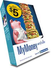
Last year, BNZ introduced “Out of a Box Banking.” The idea is to make financial services less ethereal and more tangible by “packaging” them in boxes and selling them on shelves in branches.
The product lineup includes MyMoney Checking, Visa Lite and Life Insurance, among a handful of others.
You can literally walk into BNZ’s branches and buy these products off-the-shelf for $5.
BNZ is clearly linking their brand promise to the idea of “easier banking.” Their kits make basic financial services look easy, simple and straightforward. No hassles, and all for only $5 each.
You can catch a glimpse of the bank’s brand strategy at a page on their website, where they commit to being “approachable, energetic and boldly innovative.” Those feel distinctly like the kind of “Brand Personality Attributes” that would be defined in a brand strategy.

Fractional Marketing for Financial Brands
Services that scale with you.

Unlocking Digital Acquisition: A Bank’s Journey to Become Digital-First
This webinar will offer a comprehensive roadmap for digital marketing success, from building foundational capabilities and structures and forging strategic partnerships, to assembling the right team.
Read More about Unlocking Digital Acquisition: A Bank’s Journey to Become Digital-First
While off-the-shelf financial solutions won’t appeal to everyone, there is bound to be a measurable market segment that just doesn’t feel like “engaging in a highly personalized dialogue with a knowledgeable financial advisor.” (“I’m just here for a checking account man.”)
With $5 life insurance – in a box – BNZ is making the product much more accessible to consumers, especially those who might not otherwise think twice about life insurance. (“Oh hey, look: life insurance. I should probably get some of that too.”)
BNZ is expanding its line of kits to include simple tutorials:
BNZ’s expanded line of “pre-packaged” finances, cross-selling additional services.
The notion of retailing financial services “in a box” isn’t entirely new. For instance, Progressive Insurance has a TV ad campaign built entirely around an imaginary “store” where aisles of shelves hold Progressive products in boxes.
“Pig Tales” Brand Ads
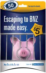
BNZ unveiled its new “Out of a Box” banking concept about 9 months ago in a massive, multimedia rollout. The bank’s creative centers around a herd of colorful, likable, animated piggybanks.
“Pig Tales: The Beginning,” a :90 video that introduces the piggybank concept.
BNZ has a YouTube account, BNZTV, where you can watch 18 different videos, most of them part of the Pig Tales series, including product-specific spots for MyMoney Checking, Lite Visa and Life Insurance.
Switching to BNZ is like breaking out of jail.
You’ve got to wonder what the future holds for “the piggybank” in the financial industry? What is the lifespan for this popular financial symbol? Will it still have relevance in a few years? For that matter, how long will coins be an integral part of our payment systems?

Logo
To cap what appears to be a year-long rebranding effort, the Bank of New Zealand just introduced a new logo. It’s replacing its venerated name and Southern Cross with what it calls “a less formal look to reflect the BNZ culture of today.”

The old Bank of New Zealand logo had been in use for at least 20 years.
“Our customers have been letting us know it’s time to make a change,” said Blair Vernon, BNZ/General Manager of Strategy & Marketing, in an article from the New Zealand Herald.
If customers said it was time to change the logo, it’s probably because someone was asking them – not necessarily because people volunteered the idea.
Indeed, BNZ ran the old logo through focus groups. “Testing suggested people didn’t see it as reflective of the progressive, welcoming, warm friendly organization we believe we are these days,” said Blair. He said the warmth and approachability of the bank’s piggies campaign created “a bit of a disconnect” with the formality of the old brand.

The new BNZ logo.
One critic of the new logo said it looked like it was squeezed out of a tube of toothpaste (which it sort of does). But if BNZ was looking to project a fresh, contemporary, clean and casual image, they’ve arguably accomplished their objective.
About the changing the name to the BNZ acronym, Blair said, “We’ve shifted Bank of New Zealand to BNZ because that’s how most of our customers refer to us.”
That makes sense.
But the timing of the logo change doesn’t. It probably would have made more sense to change the logo back at the launch of their Pig Tales campaign, and after they introduced the “Banking Out of a Box” concept. Now they have to rebrand everything with the new logo (including 180 branches).


