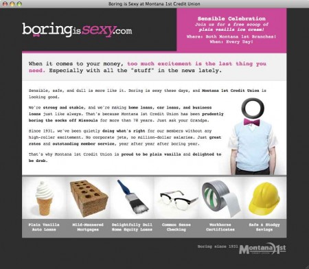
“Boring is sexy these days,” says Montana 1st Credit Union on its promotional microsite, BoringIsSexy.com. The credit union’s agency, iDiz, cleverly used the promo’s URL as the campaign catchphrase — BoringIsSexy.com. The word “sexy” isn’t something you see in financial marketing very often, nor the color pink. The attention-grabbing combination is very unexpected.
If you’re going to do a “boring” promotion, there is probably no better typeface you could pick than Courier, which is what Montana 1st uses exclusively on its Boring Is Sexy microsite. The project recently won an award from CUNA for marketing excellence.
( 12/03/2021 Editor’s Note: The BoringIsSexy.com domain is no longer active. )
“When it comes to your money, too much excitement is the last thing you need,” reads the introduction on the microsite. “Montana 1st Credit Union has been prudently boring the socks off Missoula for more than 78 years. Just ask your Grandpa. Since 1931, we’ve been quietly doing what’s right for our members without any high-roller excitement. No corporate jets, no million-dollar salaries. Just great rates and outstanding member service, year after year after boring year.”
Now that’s great copy. It has personality, style and attitude. There’s a distinct voice with a relevant message and points-of-proof. Even the credit union’s new slogan reflects the plain-vanilla message and tone:
![]()
While some financial institutions struggle to find a way to weave even a single product into their online promotions, Montana 1st has managed to successfully feather in a full range of products on the microsite’s homepage — six, to be exact. And they all have been given wonderfully unexciting names:
- Plain Vanilla Auto Loans
- Mild-Mannered Mortgages
- Delightfully Dull Home Equity Loans
- Common Sense Checking
- Workhorse Certificates
- Safe & Stodgy Savings
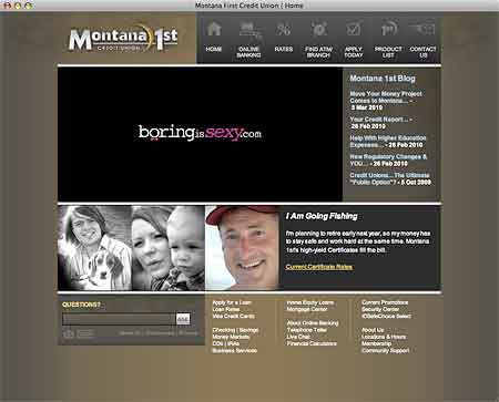
Clicking on any of the product links takes visitors back to the main corporate website for Montana 1st. The two sites may look a different, but there is continuity of message and tone.

Why Industry Cloud for Banking?
PwC’s Industry Cloud for Banking helps deliver personalized products and services that today’s customers expect.

Navigating Credit Card Issuing in an Uncertain Economic Environment
Build a modern credit card strategy that balances profitability and risk, adopts the latest technology and delivers the customization that cardholders demand.
Read More about Navigating Credit Card Issuing in an Uncertain Economic Environment
And if plain vanilla is your thing, you can swing by one of two Montana 1st branches for a free scoop of ice cream…every day.
Montana 1st is doing something else a little unusual. They are promoting their microsite with a giant banner ad right on the homepage of their main website.
Banks and credit unions typically use microsites to drive traffic back to their main website, not the other way around. Montana 1st proudly redirects visitors to its corporate site over to BoringIsSexy.com.
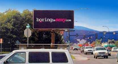
Very few financial institutions would be comfortable running a “teaser” billboard like this — nothing but a URL, not even a logo.


